
After celebrating their 40th Anniversary, the Mohawk Valley Center for the Arts wanted to refresh their branding and logo. Their goals were to be more colorful, more modern but with lasting power, and to reflect all the different mediums of art they support and promote for the residents of the Mohawk Valley.

Previous MVCA logo
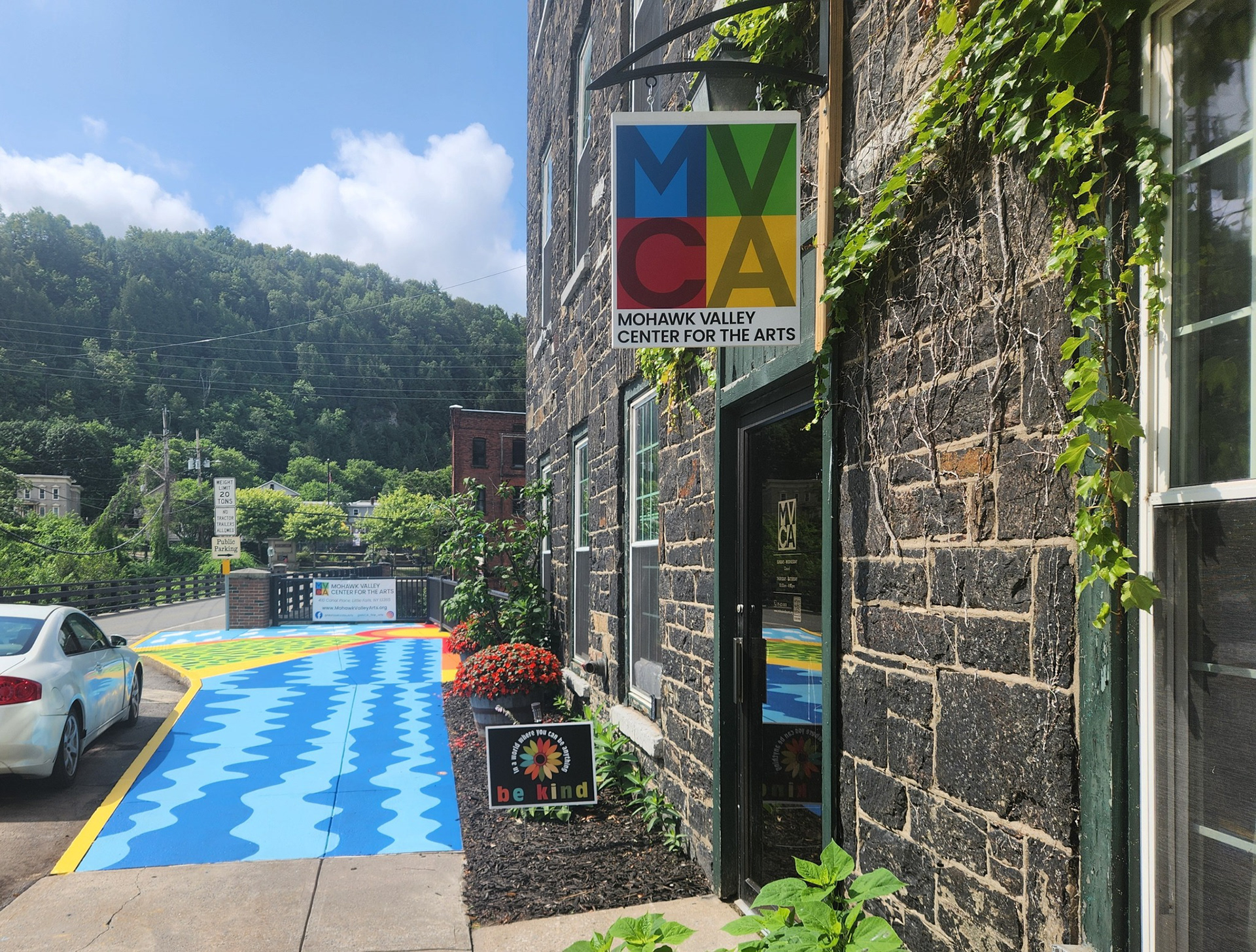
New logo in use for their gallery location sign
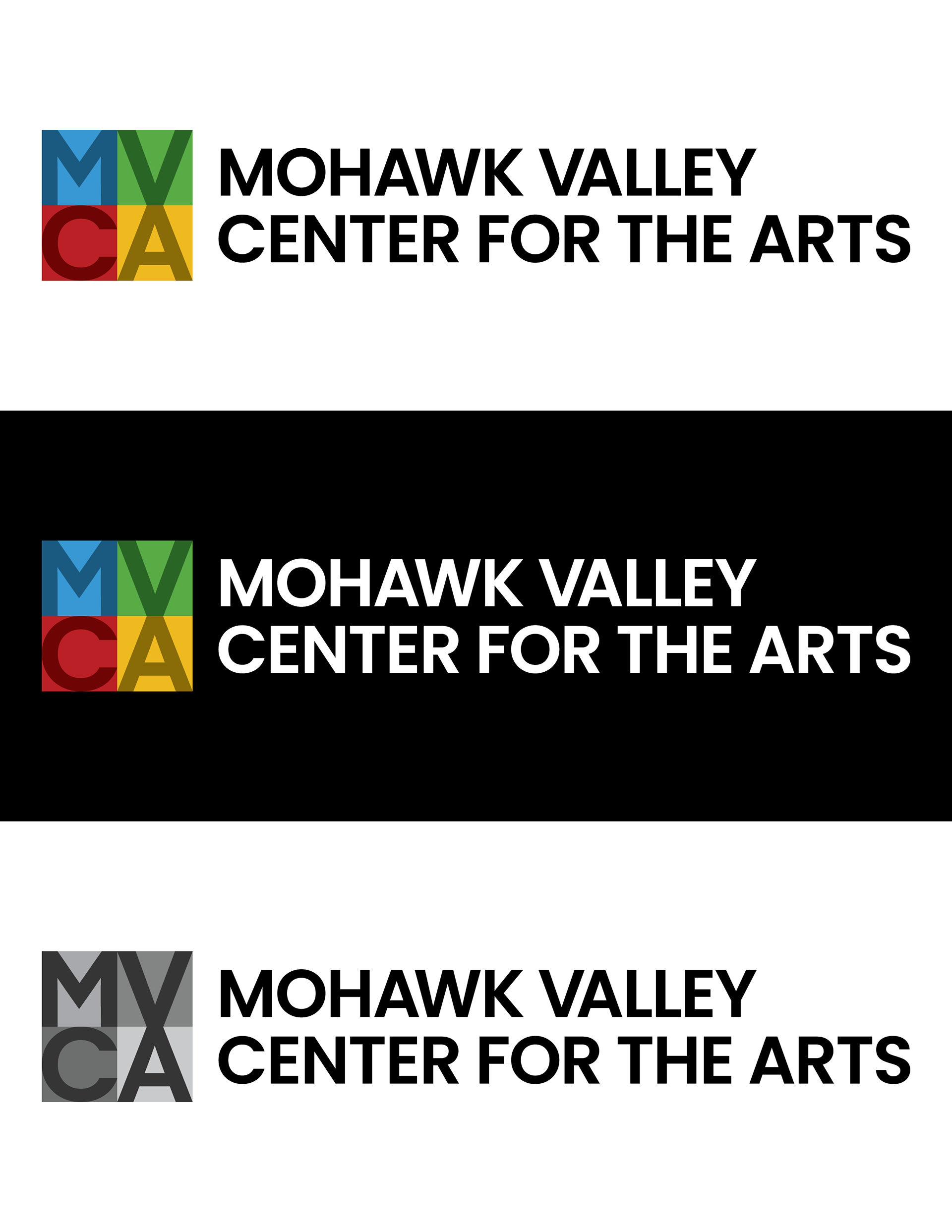
Logo Variations
Primary logo, icon and name
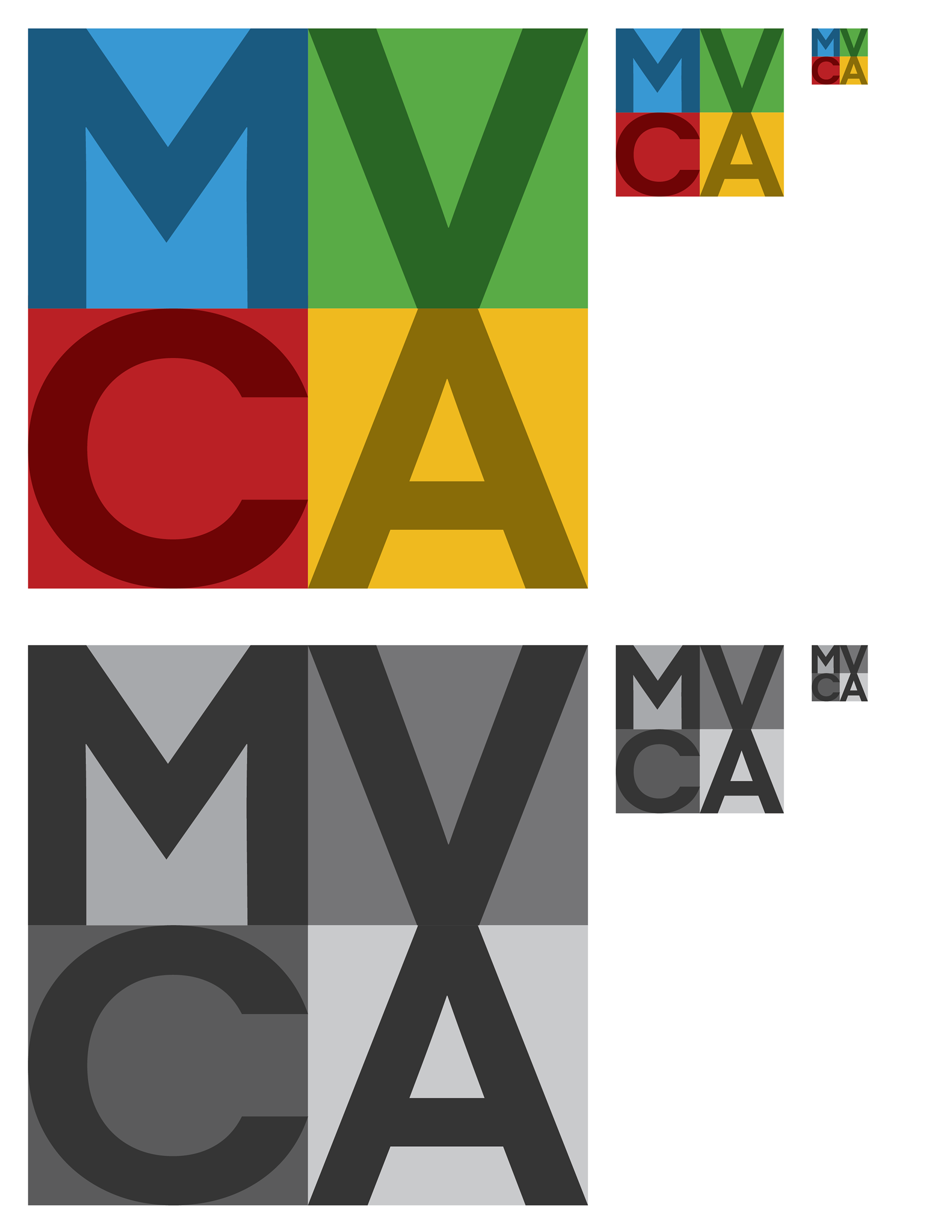
Icon usage at different sizes

Name only on the new brand colors