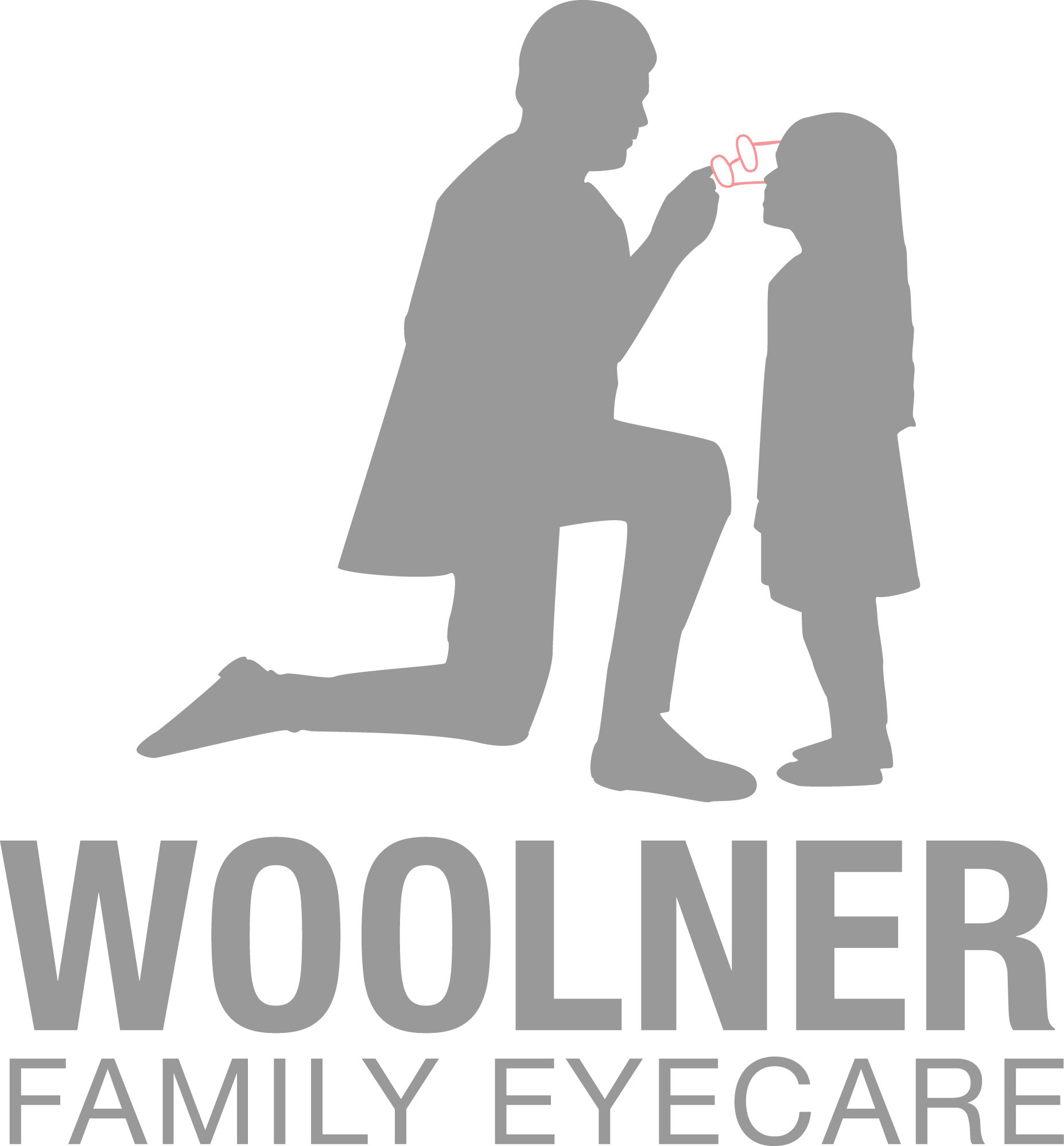
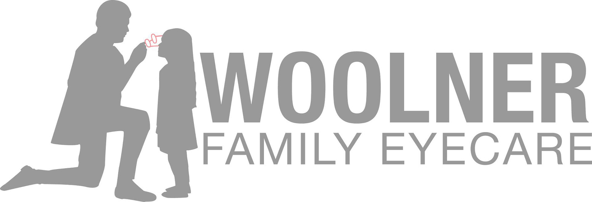
Old logo, horizontal and vertical
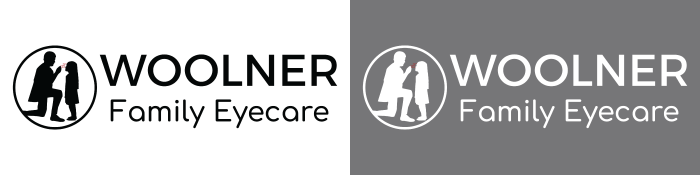

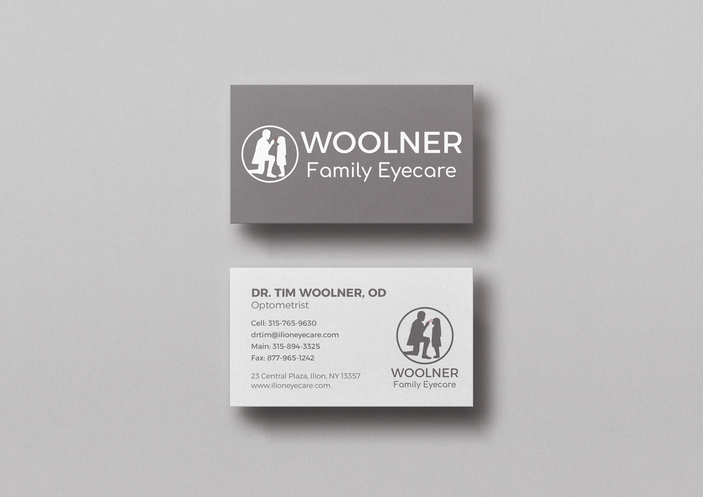
After exploring several font pairings and various crops of the icon, we decided on the design above. The circle around the icon helps ground it and the new typography is still inviting, evokes a family-friendly atmosphere, and has lasting powering.
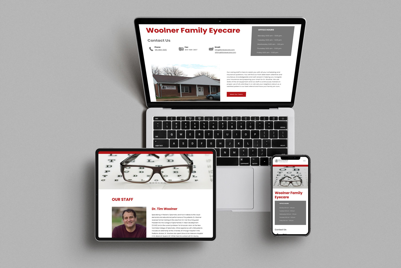
Website Redesign
The goals for the new website were making easy to read and use, and to encourage clients to make appointments. Below you'll see the old website compared to the new one. I focused on legibility, keeping the important information easy to find, and organizing the staff page. The end result fulfilled all the goals and left Woolner Eyecare with a website that reflected their new branding.
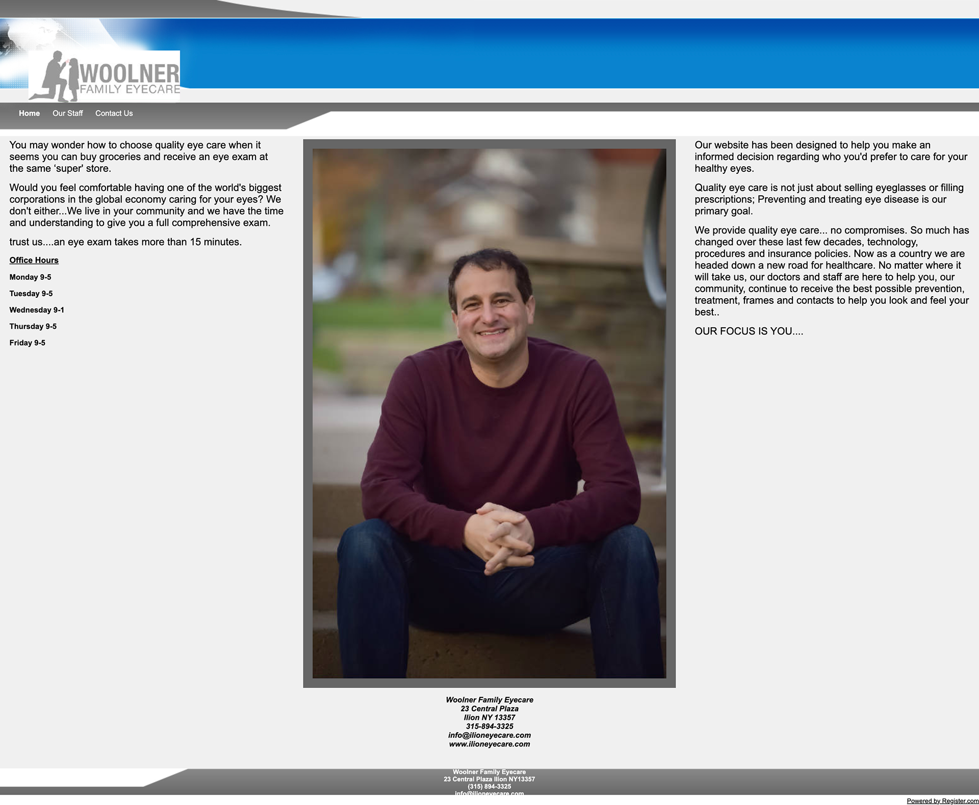
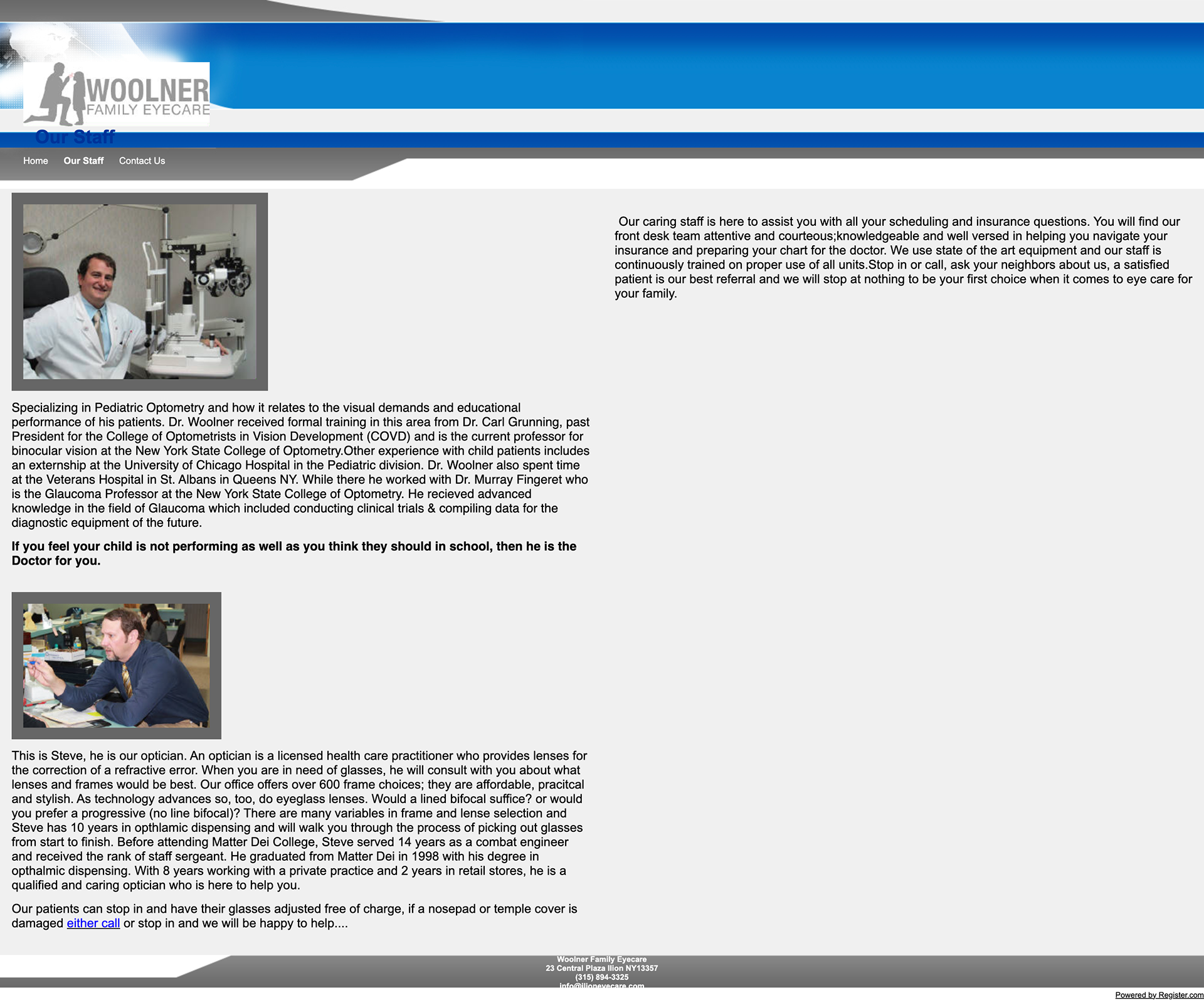
Old website